RMX203
20.08.2026
Telefon: +49 (511) 365 53 43 oder folge uns auf
Willkommen zu unserem neuesten Blogpost über eine durchsuchbare Combobox als LWC in Salesforce! Normale Comboboxen sind bei vielen Optionen schlecht zu bedienen. Die durchsuchbare Combobox kann auch mit hunderten von Optionen umgehen. In diesem Artikel werden wir einen spannenden Einblick in die Implementierung dieser praktischen Funktion geben. Egal, ob du ein erfahrener Salesforce-Entwickler bist oder einfach nur neugierig auf neue LWC-Features, hier erfährst du alles, was du über die Erstellung einer durchsuchbaren Combobox wissen musst. Lass uns direkt loslegen und herausfinden, wie du diese beeindruckende Funktion in Salesforce integrieren kannst.
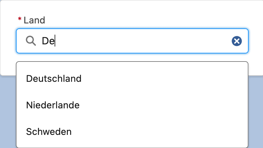
Wenn du die Combobox in deiner LWC verwenden möchtest, kannst du das mit folgendem HTML-Code machen:
<template>
    <div class="slds-tabs_card">
        <div class="slds-form-element slds-form-element_stacked slds-m-left_x_small">
            <c-combobox name="Country"
                        required="true"
                        restricted="true"
                        label="Land"
                        message-when-value-missing="Bitte wählen Sie ein Land aus!"
                        options={countries}
                        onchange={handleCountryChange}
            ></c-combobox>
        </div>
    </div>
</template>
Ich habe mich bei den properties und handlern an die Standard lightning-combobox angelehnt. Die suchbare combobox sollte also so funktionieren, wie du es gewohnt bist. Allerdings gibt es zwei Ausnahmen:
Hier nun der JavaScript-Code für den Controller bei der Benutzung der Combobox:
import {LightningElement, api, track} from 'lwc';
const CLS_LIST_ITEM = 'slds-media slds-listbox__option slds-listbox__option_plain slds-media_small';
const KEY_ARROW_UP = 38;
const KEY_ARROW_DOWN = 40;
const KEY_ENTER = 13;
const KEY_TAB = 9;
const KEY_ESC = 27;
const VARIANT_LABEL_STACKED = 'label-stacked';
const VARIANT_LABEL_INLINE = 'label-inline';
const VARIANT_LABEL_HIDDEN = 'label-hidden';

export default class Combobox extends LightningElement {
    @api label;
    @api variant = VARIANT_LABEL_STACKED;
    @api required;
    @api messageWhenValueMissing = 'Please select or enter a value';
    @api messageWhenTooLong;
    @api messageWhenTooShort;
    @api name;
    @api minLength;
    @api maxLength;
    @api placeholder;
    @api restricted = false;

    // template parameters
    searchResults = [];          // List of filtered options
    @track userInput = "";      // Input of the user

    // internal parameters
    _focusedResultIndex = null;    // if the list is navigated by keyboard the index of the item
    _cancelBlur = false;
    _picklistOrdered;                   // all picklist entries ordered by label
    _oldUserInput = "";          // input before last change event
    @track _selectedOption;             // if restricted, the selected option
    @track _options = [];

    @api
    get options() {
        return this._options;
    }
    set options(options) {
        this._options = options;
        // order options alphabetically by sort field or if not present by label
        if ( this._options ) {
            this._picklistOrdered = this._options.map(obj => ({...obj}));
            this._picklistOrdered = this._picklistOrdered.sort((a, b)=>{
                const sorta = a.hasOwnProperty('sort') ? a.sort : a.label;
                const sortb = b.hasOwnProperty('sort') ? b.sort : b.label;
                if(sorta < sortb) {
                    return -1;
                } else if ( sorta > sortb ) {
                    return 1;
                } else return 0;
            })
        }
    }

    @api
    get value() {
        if ( this.restricted ) {
            // if we simulate a combobox, return the api value
            return this._selectedOption?.value;
        } else {
            return this.userInput;
        }
    }
    set value( newVal ) {
        if ( this.restricted ) {
            // if we simulate a combobox, set the option
            this._selectedOption = this._picklistOrdered.find(opt => opt.value === newVal );
            this.userInput = this._selectedOption.label;
        } else {
            // if it just a input with, set user input
            this.userInput = newVal;
        }
        this._oldUserInput = this.userInput;
    }

    get hasSearchResults() {
        return this.searchResults.length > 0;
    }

    handleChange(event) {
        // filter combobox
        const input = event.detail.value.toLowerCase();
        const result = this._picklistOrdered.filter((picklistOption) =>
            picklistOption.label.toLowerCase().includes(input)
        );
        this.userInput = event.detail.value;
        let inputField = this.template.querySelector('lightning-input');
        if ( result.length === 0 ) {
            // if we simulate a combo box and the user input leads to no results, prevent input
            if ( this.restricted ) {
                this.userInput = this._oldUserInput;
                inputField.value = this._oldUserInput;
            } else {
                //hide listbox
                this.clearSearchResults();
            }
        } else {
            // refresh combobox selection
            this._focusedResultIndex = null;
            this.styleCombobox(result);
        }
        this._oldUserInput = this.userInput;

        // clear error message for custom validity
        if ( !inputField.validity.valid ) {
            inputField.setCustomValidity("");
            inputField.reportValidity();
        }

        // if we simulate a combobox, stop event propagation
        if ( this.restricted ) {
            event.stopPropagation();
        }
    }

    styleCombobox(result) {
        this.searchResults = result.map((result, i) => {
            // add slds-has-focus to the selected result for keyboard navigation
            let cls = CLS_LIST_ITEM + (this._focusedResultIndex === i ? ' slds-has-focus' : '');
            return {
                "label" : result.label,
                "value" : result.value,
                "classes" : cls
            };
        });
    }

    handleOptionSelected(event) {
        // get api value of selected option
        const selectedValue = event.currentTarget.dataset.value;
        this._selectedOption = this._picklistOrdered.find(
            (picklistOption) => picklistOption.value === selectedValue
        );
        this.userInput = this._selectedOption.label;
        this._oldUserInput = this._selectedOption.label;
        // hide list box
        this.clearSearchResults();
        // notify parent component of the change
        this.dispatchEvent(new CustomEvent("change",
            {
                detail:
                    {
                        value   : this._selectedOption.label,
                        name    : this.name,
                        label   : this._selectedOption.label,
                        apiName : this._selectedOption.value
                    }
            }));
        this.reportValidity();
    }

    handleComboboxMouseDown(event) {
        this._cancelBlur = true;
    }
    handleComboboxMouseUp() {
        this._cancelBlur = false;
        // Re-focus to text input for the next blur event
        this.template.querySelector('lightning-input').focus();
    }

    clearSearchResults() {
        this.searchResults = [];
    }

    handleOnFocus() {
        this._focusedResultIndex = null;
        // don't open listbox if the user returns and a value has already been selected
        if ( this._selectedOption ) return;
        if ( this.searchResults.length === 0) {
            this.styleCombobox(this._picklistOrdered)
        }
    }

    handleBlur( event ) {
        if ( this._cancelBlur ) {
            return;
        }
        let inputField = this.template.querySelector('lightning-input');
        // Close search results if field is left
        this.clearSearchResults();

        // handle required message
        this.reportValidity();
    }

    handleKeyDown( event ) {
        if (this._focusedResultIndex === null) {
            this._focusedResultIndex = -1;
        }
        if (event.keyCode === KEY_ARROW_DOWN) {
            // If we hit 'down', select the next item, or cycle over.
            this._focusedResultIndex++;
            if (this._focusedResultIndex >= this.searchResults.length) {
                this._focusedResultIndex = 0;
            }
            this.scrollToSelectedItem();
            event.preventDefault();
        } else if (event.keyCode === KEY_ARROW_UP) {
            // If we hit 'up', select the previous item, or cycle over.
            this._focusedResultIndex--;
            if (this._focusedResultIndex < 0) {
                this._focusedResultIndex = this.searchResults.length - 1;
            }
            this.scrollToSelectedItem()
            event.preventDefault();
        } else if (event.keyCode === KEY_ENTER && this._focusedResultIndex >= 0 && this.hasSearchResults) {
            // If the user presses enter, and the box is open, and we have used arrows,
            // treat this just like a click on the listbox item
            const selected = this.searchResults[this._focusedResultIndex].value;
            const li = this.template.querySelector(`[data-value="${selected}"]`);
            li.click();
            event.preventDefault();
        } else if ( event.keyCode === KEY_TAB && this.hasSearchResults ) {
            // if the user presses TAB close the list box and go to the next input
            this.clearSearchResults();
        } else if ( event.keyCode === KEY_ESC ) {
            // if the user presses ESC close the list box
            this.clearSearchResults();
        }
        this.styleCombobox(this.searchResults);
    }

    scrollToSelectedItem() {
        const selected = this.searchResults[this._focusedResultIndex].value;
        const li = this.template.querySelector(`[data-value="${selected}"]`);
        li.focus();

        let bounding = li.getBoundingClientRect();
        let parentElement = this.template.querySelector('.slds-dropdown');
        let parentBounding = parentElement.getBoundingClientRect();

        let outOfView = (bounding.bottom + bounding.height) > parentBounding.bottom || bounding.top < parentBounding.top || bounding.top < 0|| (bounding.bottom + bounding.height) > window.innerHeight;

        if(outOfView){
            li.scrollIntoView({ behavior: "smooth", block: "nearest", inline: "nearest" });
        }
    }

    @api
    reportValidity() {
        let inputField = this.template.querySelector('lightning-input');
        if ( this.required && this.userInput === "") {
            inputField.setCustomValidity(this.messageWhenValueMissing);
        } else {
            inputField.setCustomValidity("");
        }
        return inputField.reportValidity();
    }

    @api
    checkValidity() {
        let inputField = this.template.querySelector('lightning-input');
        if ( this.required && this.userInput === "") {
            return false;
        }
        return inputField.checkValidity();
    }


    // STYLE EXPRESSIONS
    get getFormElementClass() {
        return this.variant === VARIANT_LABEL_INLINE
            ? 'slds-form-element slds-form-element_horizontal'
            : 'slds-form-element';
    }

    get getLabelClass() {
        return this.variant === VARIANT_LABEL_HIDDEN
            ? 'slds-form-element__label slds-assistive-text'
            : 'slds-form-element__label';
    }

    get getDropdownClass() {
        let css = 'slds-combobox slds-dropdown-trigger slds-dropdown-trigger_click ';
        if ( this.searchResults.length > 0 ) {
            css += 'slds-is-open';
        }
        return css;
    }
}
Damit du die durchsuchbare Combobox auch in deiner Salesforce Umgebung verwenden kannst, musst du den nachfolgenden Code als LWC deployen.
<template>
    <div class={getFormElementClass}>
        <label lwc:if={label} class={getLabelClass} id="combobox-label-id-130" for="combobox">
            <abbr lwc:if={required} class="slds-required" title="required">*</abbr>
            {label}
        </label>
        <div class="slds-form-element__control">
            <div class="slds-combobox_container">
                <div class={getDropdownClass} aria-expanded={hasResults} aria-haspopup="listbox" role="combobox">
                    <div class="slds-combobox__form-element slds-input-has-icon" role="none">
                        <lightning-input
                            id="combobox"
                            class="inputField"
                            label={label}
                            type="search"
                            variant="label-hidden"
                            onfocus={handleOnFocus}
                            onchange={handleChange}
                            onkeydown={handleKeyDown}
                            value={userInput}
                            onblur={handleBlur}
                            message-when-value-missing={messageWhenValueMissing}
                            message-when-too-long={messageWhenTooLong}
                            message-when-too-short={messageWhenTooShort}
                            min-length={minLength}
                            max-length={maxLength}
                            placeholder={placeholder}
                        ></lightning-input>
                    </div>
                    <div class="slds-dropdown slds-dropdown_length-with-icon-5 slds-dropdown_fluid" style="overflow: auto" id="listbox" tabindex="0"
                         role="listbox" onmousedown={handleComboboxMouseDown} onmouseup={handleComboboxMouseUp}>
                        <ul class="slds-listbox slds-listbox_vertical" role="presentation">
                            <template lwc:if={hasSearchResults} for:each={searchResults} for:item="searchResult">
                                <li key={searchResult.value}  role="presentation">
                                    <div class={searchResult.classes}
                                         data-value={searchResult.value}
                                         onclick={handleOptionSelected}
                                         role="option">
                                        <span class="slds-media__body">
                                            <span class="slds-listbox__option-text slds-listbox__option-text_entity" title={searchResult.label}>
                                                {searchResult.label}
                                            </span>
                                        </span>
                                    </div>
                                </li>
                            </template>
                        </ul>
                    </div>
                </div>
            </div>
        </div>
    </div>
</template>import {LightningElement, api, track} from 'lwc';
const CLS_LIST_ITEM = 'slds-media slds-listbox__option slds-listbox__option_plain slds-media_small';
const KEY_ARROW_UP = 38;
const KEY_ARROW_DOWN = 40;
const KEY_ENTER = 13;
const KEY_TAB = 9;
const KEY_ESC = 27;
const VARIANT_LABEL_STACKED = 'label-stacked';
const VARIANT_LABEL_INLINE = 'label-inline';
const VARIANT_LABEL_HIDDEN = 'label-hidden';
export default class Combobox extends LightningElement {
@api label;
@api variant = VARIANT_LABEL_STACKED;
@api required;
@api options;
@api messageWhenValueMissing = 'Please select or enter a value';
@api messageWhenTooLong;
@api messageWhenTooShort;
@api name;
@api minLength;
@api maxLength;
@api placeholder;
@api restricted = false;
// template parameters
searchResults = []; // List of filtered options
@track userInput = ""; // Input of the user
// internal parameters
_focusedResultIndex = null; // if the list is navigated by keyboard the index of the item
_cancelBlur = false;
_picklistOrdered; // all picklist entries ordered by label
_oldUserInput = ""; // input before last change event
@track _selectedOption; // if restricted, the selected option
@api
get value() {
if ( this.restricted ) {
// if we simulate a combobox, return the api value
return this._selectedOption?.value;
} else {
return this.userInput;
}
}
set value( newVal ) {
if ( this.restricted ) {
// if we simulate a combobox, set the option
this._selectedOption = this._picklistOrdered.find(opt => opt.value === newVal );
this.userInput = this._selectedOption.label;
} else {
// if it just a input with, set user input
this.userInput = newVal;
}
this._oldUserInput = this.userInput;
}
get hasSearchResults() {
return this.searchResults.length > 0;
}
connectedCallback() {
// order options alphabetically by sort field or if not present by label
if ( this.options ) {
this._picklistOrdered = this.options.map(obj => ({...obj}));
this._picklistOrdered = this._picklistOrdered.sort((a, b)=>{
const sorta = a.hasOwnProperty('sort') ? a.sort : a.label;
const sortb = b.hasOwnProperty('sort') ? b.sort : b.label;
if(sorta < sortb) {
return -1;
} else if ( sorta > sortb ) {
return 1;
} else return 0;
})
}
}
handleChange(event) {
// filter combobox
const input = event.detail.value.toLowerCase();
const result = this._picklistOrdered.filter((picklistOption) =>
picklistOption.label.toLowerCase().includes(input)
);
this.userInput = event.detail.value;
let inputField = this.template.querySelector('lightning-input');
if ( result.length === 0 ) {
// if we simulate a combo box and the user input leads to no results, prevent input
if ( this.restricted ) {
this.userInput = this._oldUserInput;
inputField.value = this._oldUserInput;
} else {
//hide listbox
this.clearSearchResults();
}
} else {
// refresh combobox selection
this._focusedResultIndex = null;
this.styleCombobox(result);
}
this._oldUserInput = this.userInput;
// clear error message for custom validity
if ( !inputField.validity.valid ) {
inputField.setCustomValidity("");
inputField.reportValidity();
}
// if we simulate a combobox, stop event propagation
if ( this.restricted ) {
event.stopPropagation();
}
}
styleCombobox(result) {
this.searchResults = result.map((result, i) => {
// add slds-has-focus to the selected result for keyboard navigation
let cls = CLS_LIST_ITEM + (this._focusedResultIndex === i ? ' slds-has-focus' : '');
return {
"label" : result.label,
"value" : result.value,
"classes" : cls
};
});
}
handleOptionSelected(event) {
// get api value of selected option
const selectedValue = event.currentTarget.dataset.value;
this._selectedOption = this._picklistOrdered.find(
(picklistOption) => picklistOption.value === selectedValue
);
this.userInput = this._selectedOption.label;
this._oldUserInput = this._selectedOption.label;
// hide list box
this.clearSearchResults();
// notify parent component of the change
this.dispatchEvent(new CustomEvent("change",
{
detail:
{
value : this._selectedOption.label,
name : this.name,
label : this._selectedOption.label,
apiName : this._selectedOption.value
}
}));
this.reportValidity();
}
handleComboboxMouseDown(event) {
this._cancelBlur = true;
}
handleComboboxMouseUp() {
this._cancelBlur = false;
// Re-focus to text input for the next blur event
this.template.querySelector('lightning-input').focus();
}
clearSearchResults() {
this.searchResults = [];
}
handleOnFocus() {
this._focusedResultIndex = null;
// don't open listbox if the user returns and a value has already been selected
if ( this._selectedOption ) return;
if ( this.searchResults.length === 0) {
this.styleCombobox(this._picklistOrdered)
}
}
handleBlur( event ) {
if ( this._cancelBlur ) {
return;
}
let inputField = this.template.querySelector('lightning-input');
// Close search results if field is left
this.clearSearchResults();
// handle required message
this.reportValidity();
}
handleKeyDown( event ) {
if (this._focusedResultIndex === null) {
this._focusedResultIndex = -1;
}
if (event.keyCode === KEY_ARROW_DOWN) {
// If we hit 'down', select the next item, or cycle over.
this._focusedResultIndex++;
if (this._focusedResultIndex >= this.searchResults.length) {
this._focusedResultIndex = 0;
}
this.scrollToSelectedItem();
event.preventDefault();
} else if (event.keyCode === KEY_ARROW_UP) {
// If we hit 'up', select the previous item, or cycle over.
this._focusedResultIndex--;
if (this._focusedResultIndex < 0) {
this._focusedResultIndex = this.searchResults.length - 1;
}
this.scrollToSelectedItem()
event.preventDefault();
} else if (event.keyCode === KEY_ENTER && this._focusedResultIndex >= 0 && this.hasSearchResults) {
// If the user presses enter, and the box is open, and we have used arrows,
// treat this just like a click on the listbox item
const selected = this.searchResults[this._focusedResultIndex].value;
const li = this.template.querySelector(`[data-value="${selected}"]`);
li.click();
event.preventDefault();
} else if ( event.keyCode === KEY_TAB && this.hasSearchResults ) {
// if the user presses TAB close the list box and go to the next input
this.clearSearchResults();
} else if ( event.keyCode === KEY_ESC ) {
// if the user presses ESC close the list box
this.clearSearchResults();
}
this.styleCombobox(this.searchResults);
}
scrollToSelectedItem() {
const selected = this.searchResults[this._focusedResultIndex].value;
const li = this.template.querySelector(`[data-value="${selected}"]`);
li.focus();
let bounding = li.getBoundingClientRect();
let parentElement = this.template.querySelector('.slds-dropdown');
let parentBounding = parentElement.getBoundingClientRect();
let outOfView = (bounding.bottom + bounding.height) > parentBounding.bottom || bounding.top < parentBounding.top || bounding.top < 0|| (bounding.bottom + bounding.height) > window.innerHeight;
if(outOfView){
li.scrollIntoView({ behavior: "smooth", block: "nearest", inline: "nearest" });
}
}
@api
reportValidity() {
let inputField = this.template.querySelector('lightning-input');
if ( this.required && this.userInput === "") {
inputField.setCustomValidity(this.messageWhenValueMissing);
} else {
inputField.setCustomValidity("");
}
return inputField.reportValidity();
}
@api
checkValidity() {
let inputField = this.template.querySelector('lightning-input');
if ( this.required && this.userInput === "") {
return false;
}
return inputField.checkValidity();
}
// STYLE EXPRESSIONS
get getFormElementClass() {
return this.variant === VARIANT_LABEL_INLINE
? 'slds-form-element slds-form-element_horizontal'
: 'slds-form-element';
}
get getLabelClass() {
return this.variant === VARIANT_LABEL_HIDDEN
? 'slds-form-element__label slds-assistive-text'
: 'slds-form-element__label';
}
get getDropdownClass() {
let css = 'slds-combobox slds-dropdown-trigger slds-dropdown-trigger_click ';
if ( this.searchResults.length > 0 ) {
css += 'slds-is-open';
}
return css;
}
}
.inputField {
    border : 0;
    padding: 0;
}

.listbox {
    padding-top: 0;
}Bleib schlau und melde dich hier an:
Wir gehen mit deinen Daten sehr gewissenhaft um und schützen sie wie unsere eigenen. Außerdem ist ein Abmelden jederzeit möglich.

Das Salesforce Summer 26 Release vom Juni 2026 bringt zahlreiche spannende Neuerungen und Verbesserungen, die dir helfen, deine Arbeitsabläufe zu optimieren und effizienter zu gestalten.…

Salesforce zentralisiert sein Schulungs- und Zertifizierungsmodell Salesforce führt ab Mitte 2025 tiefgreifende Änderungen im gesamten Schulungs- und Zertifizierungsprogramm durch. Ziel ist eine klare Zentralisierung aller…

Das Salesforce Spring 26 Release vom Januar / Februar 2026 bringt zahlreiche spannende Neuerungen und Verbesserungen, die dir helfen, deine Arbeitsabläufe zu optimieren und effizienter…
Bleib schlau und melde dich hier an:
Wir gehen mit deinen Daten sehr gewissenhaft um und schützen sie wie unsere eigenen. Außerdem ist ein Abmelden jederzeit möglich.
Sie sehen gerade einen Platzhalterinhalt von Vimeo. Um auf den eigentlichen Inhalt zuzugreifen, klicken Sie auf die Schaltfläche unten. Bitte beachten Sie, dass dabei Daten an Drittanbieter weitergegeben werden.
Mehr InformationenSie sehen gerade einen Platzhalterinhalt von YouTube. Um auf den eigentlichen Inhalt zuzugreifen, klicken Sie auf die Schaltfläche unten. Bitte beachten Sie, dass dabei Daten an Drittanbieter weitergegeben werden.
Mehr InformationenSie müssen den Inhalt von reCAPTCHA laden, um das Formular abzuschicken. Bitte beachten Sie, dass dabei Daten mit Drittanbietern ausgetauscht werden.
Mehr Informationen